Table of Contents
ToggleChoosing the right paint color for a bathroom is trickier than painting a bedroom or living room. Bathrooms deal with high humidity, limited natural light, and tight square footage, all factors that change how color reads on the wall. A shade that looks fresh and airy in the can might feel claustrophobic once it’s on all four walls of a 5×8 powder room. This guide breaks down which colors work best in different bathroom scenarios, what finishes hold up to moisture, and how to pair hues for a cohesive look.
Key Takeaways
- Bathroom paint colors are more critical than other rooms because moisture, humidity, and poor lighting change how color appears, making light shades and soft blues ideal for small spaces to maximize perceived size.
- Satin, eggshell, or semi-gloss finishes with mildewcide formulas are essential for bathroom paint durability, while flat finishes should be avoided unless specially formulated for moisture resistance.
- 2026 bathroom color trends favor warm neutrals, calming blues and greens like Rainwashed and sage green, and earthy tones such as terracotta and soft pink, replacing the cool-gray-everything trend of recent years.
- Choose your bathroom paint color before finalizing tile, fixtures, and hardware, since the wall color serves as the backdrop that ties all design elements together and influences perceived finish tones.
- Testing paint samples on actual bathroom walls in different lighting conditions is crucial before committing, as bathroom lighting varies throughout the day and affects how colors ultimately read in the space.
- Color combinations like monochromatic palettes for modern bathrooms, warm whites with wainscoting for farmhouse style, and accent walls in navy or deep green create polished, intentional designs across various bathroom styles.
Why Bathroom Paint Color Matters More Than You Think
Bathroom paint has to perform under conditions that would wreck a standard flat finish in a living room. Steam from showers, splashes from sinks, and poor ventilation create a breeding ground for mildew. That’s why bathroom-specific formulas contain mildewcides and are designed to resist moisture penetration. But the color itself also affects perceived space, light reflection, and even resale value.
Dark colors absorb light and make small bathrooms feel smaller, fine if you’re going for a moody powder room vibe, problematic if you’re working with a windowless 6×6 full bath. Light colors bounce available light around the room, which is critical when you’re relying on a single overhead fixture or a small frosted window. Neutral tones photograph well for listings, but a bold accent wall or unexpected hue can be a selling point if executed thoughtfully.
Finally, paint color sets the tone for everything else: tile, fixtures, hardware, and textiles. A warm beige shifts the feel of chrome faucets compared to brushed gold. A cool gray makes white subway tile look crisp: a greige softens it. Choose your wall color before you finalize grout, trim, or vanity stain, it’s the backdrop that ties the room together.
Best Paint Colors for Small Bathrooms
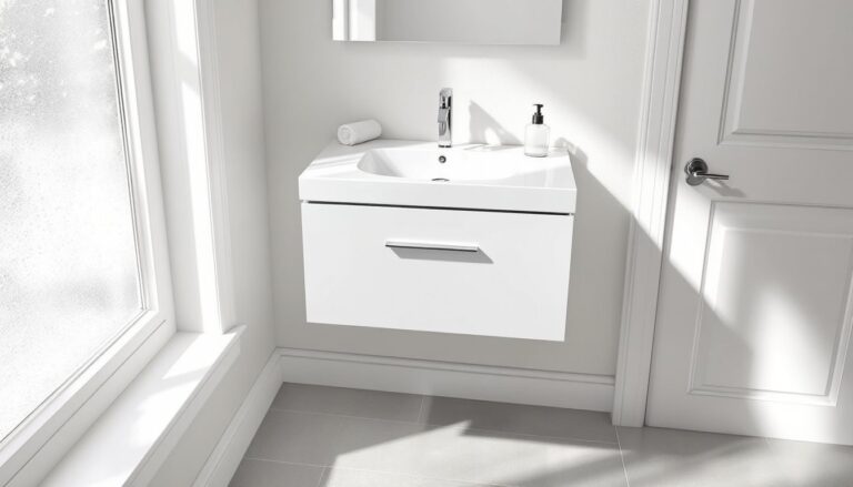
Small bathrooms need colors that visually open the space without feeling sterile. Soft whites like Benjamin Moore’s Chantilly Lace (OC-65) or Sherwin-Williams’ Alabaster (SW 7008) are go-to choices because they reflect maximum light and pair with nearly any tile or fixture color. True white (SW 7006 Extra White) can feel clinical under fluorescent lighting, stick with whites that have slight warm or cool undertones depending on your existing finishes.
Pale blues and greens work well in compact spaces. Sherwin-Williams’ Sea Salt (SW 6204) reads as a barely-there aqua that shifts with natural light. Benjamin Moore’s Palladian Blue (HC-144) leans cooler but doesn’t overwhelm a 40-square-foot half bath. These hues feel clean and spa-like without the starkness of pure white.
Light grays are a modern neutral that add sophistication without shrinking square footage. Agreeable Gray (SW 7029) is a warm greige that works in bathrooms with oak or maple vanities. Repose Gray (SW 7015) skews cooler and complements white or gray tile. Avoid grays with strong blue or purple undertones in windowless bathrooms, they can look dingy under warm bulb lighting.
A pro tip: paint the ceiling the same color as the walls in a small bathroom. Breaking up the color at the ceiling line chops the room into pieces. Carrying the shade across all surfaces makes the perimeter blur and the space feel larger.
Top Trending Bathroom Paint Colors in 2026
Color trends for 2026 lean toward nature-inspired palettes and earthy sophistication. Homeowners are moving away from the gray-everything trend and bringing warmth back into wet spaces.
Calming Blues and Greens
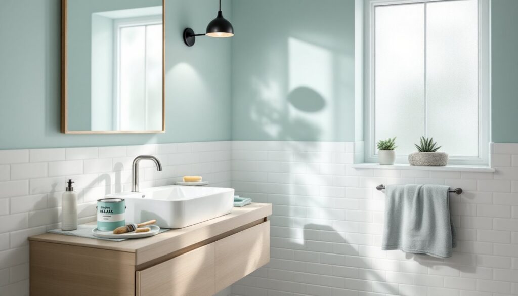
Blues and greens continue to dominate bathroom color schemes because they’re inherently linked to water and nature. Sherwin-Williams’ Rainwashed (SW 6211) is a soft, grayed-down blue-green that feels serene without reading as baby nursery. Farrow & Ball’s Green Blue (No. 84) is richer and works beautifully in bathrooms with good natural light or brass fixtures.
Deeper shades like Benjamin Moore’s Hale Navy (HC-154) are trending in powder rooms and primary bath accent walls. Navy creates drama and hides water spots better than light colors, but it requires adequate lighting, plan for sconces or pendant fixtures if you’re painting all four walls. Pair navy with white trim and matte black hardware for a crisp, modern look, or combine it with natural wood tones for a warmer design approach.
Sage green is having a major moment. Sherwin-Williams’ Softened Green (SW 6177) and Benjamin Moore’s Saybrook Sage (HC-114) bring an organic, earthy feel that pairs well with terracotta tile, natural stone, and matte white fixtures. Sage reads as neutral but adds more personality than beige.
Warm Neutrals and Earthy Tones
Warm neutrals are replacing cool grays across the board. Benjamin Moore’s Edgecomb Gray (HC-173) is technically a greige but leans warm, making it versatile for bathrooms with varied lighting. Sherwin-Williams’ Accessible Beige (SW 7036) is a true warm neutral that complements wood vanities and works in bathrooms that get morning or evening sun.
Terracotta and clay tones are emerging in accent walls and powder rooms. Sherwin-Williams’ Cavern Clay (SW 7701) brings a Southwestern warmth that works with white tile, concrete, and black fixtures. It’s bold without being loud, earthy instead of trendy. Use it on a single wall or below a chair rail if you’re hesitant to commit.
Soft pink and blush tones are also trending, especially in vintage-inspired or feminine bathrooms. Farrow & Ball’s Setting Plaster (No. 231) is a subtle, sophisticated pink that reads as neutral under most lighting. Pair it with marble, white subway tile, and polished nickel for a timeless look.
How to Choose the Right Finish for Bathroom Walls
Finish matters as much as color in a bathroom. The wrong sheen won’t hold up to humidity and frequent cleaning.
Satin or eggshell finishes are the minimum recommendation for bathrooms. They offer slight sheen, which helps moisture bead on the surface rather than soaking into the paint film. Satin is easier to wipe down than flat but doesn’t highlight wall imperfections as much as semi-gloss. Most manufacturers label their bathroom-specific paints as satin or “bath and spa” formulas with added mildew resistance.
Semi-gloss is the traditional bathroom finish and still the best choice for high-moisture areas like shower surrounds (if you’re painting above tile), behind sinks, and in rental units where durability trumps aesthetics. Semi-gloss reflects more light, which can help in dim bathrooms but will show every taping flaw and surface dent. It’s the easiest finish to scrub clean, which matters in kids’ bathrooms or powder rooms that see heavy use.
Flat or matte finishes are not recommended for full bathrooms unless you’re using a specialty product like Aura Bath & Spa from Benjamin Moore, which is formulated to resist moisture even though the low sheen. Standard flat paint will absorb water, promote mildew, and break down faster than higher-sheen options.
Always use a bathroom-specific primer before painting, especially over new drywall or existing dark colors. Primers like Zinsser Mold Killing Primer or Kilz Kitchen & Bath block stains and provide an extra moisture barrier. If you’re painting over glossy tile or previously semi-gloss paint, use a bonding primer or scuff-sand the surface first with 150-grit sandpaper to ensure adhesion.
Ventilation is critical post-paint. Run the exhaust fan during and after showers for at least 30 minutes to pull moisture out. Even the best bathroom paint will fail if humidity sits on the walls for hours after every shower.
Color Combinations That Work for Every Bathroom Style
Pairing colors correctly is the difference between a polished look and a DIY disaster. Here’s how to combine hues for common bathroom styles.
Modern/Contemporary: Stick to a monochromatic or two-tone palette. Pair a cool gray like Repose Gray on the walls with bright white trim (SW Extra White). Use matte black fixtures, hardware, and a floating vanity. Add contrast with black-framed mirrors or shelving. Keep tile minimal, white subway or large-format porcelain in gray or concrete tones.
Farmhouse/Rustic: Warm whites and soft greiges work best. Alabaster on the walls, paired with shiplap or beadboard wainscoting painted in the same shade or a slightly darker greige like Accessible Beige. Use oil-rubbed bronze or matte black hardware, a wood-framed mirror, and open shelving in natural or stained wood. Add texture with woven baskets and linen textiles.
Coastal/Nautical: Light blues and whites are the foundation. Paint walls in Sea Salt or Rainwashed, use white trim, and bring in natural wood tones through vanities or shelving. Avoid literal nautical clichés like anchors, let the color palette and natural materials do the work. Brushed nickel or chrome fixtures keep it crisp.
Traditional/Classic: Warm neutrals like Edgecomb Gray or Revere Pewter (Benjamin Moore HC-172) on the walls, paired with white wainscoting or chair rail. Use polished chrome or brushed nickel fixtures, a framed mirror, and classic white subway tile with gray grout. Add warmth with oil-rubbed bronze cabinet pulls or a vintage-style light fixture.
Bold/Eclectic: This is where accent walls shine. Paint three walls in a neutral like Alabaster and one wall in Hale Navy, Cavern Clay, or a deep green like Sherwin-Williams’ Pewter Green (SW 6208). Balance the bold wall with white or light tile, and use brass or gold fixtures to tie in warmth. Patterned tile on the floor or in a shower niche can echo the accent color.
Spa/Serene: Soft greens, pale blues, and warm whites create a calming environment. Pair Softened Green or Palladian Blue with natural stone tile, a wood vanity, and matte white fixtures. Use plants, natural fiber rugs, and minimal decor. The goal is tranquility, every element should feel intentional and uncluttered.
When choosing combinations, test samples on the actual bathroom walls. Paint a 2×2-foot section in different areas of the room and observe how the color shifts throughout the day. Bathroom lighting is rarely consistent, and a color that looks perfect at noon might feel off under evening artificial light. Purchase sample pots (usually $5–$8) before committing to gallons, it’s the cheapest insurance against a costly remodel mistake.